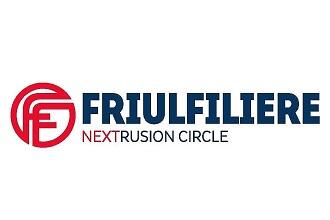
In January Friul Filiere adopted a new logo. The Friuli-based company has plans for a rebranding campaign in 2017, with the aim of communicating its market position with greater clarity and efficiency in the year leading up to its fortieth year in business.
The new logo, the first step along this path, is an evolution that carries forward the brand's history and places value on the "cerchio rosso Friul Filiere" (the Friul Filiere red circle). The name is not being changed, but simply redesigned with subtle restyling that makes it easier to read and gives it a contemporary look. The new motto “Nextrusion Circle” is of key importance, as an expression of the company's soul, a perfect circle that encompasses all the moments of a long path along which Friul Filiere accompanies the processor until the final development of a turnkey project. It is a vision towards the future (hence Next) in the extrusion sector, with an approach that originates in the idea, develops through advice and research, and is consolidated in the engineering and production of machines and dies, to conclude with various after sales services.
A new logo for an international company hoping to encompass in its world, in its "circle", those looking for a reliable partner for quality technological solutions.

Notizie più lette