Mast: fifty years and a new logo
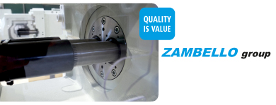
This year, 2017, sees the fiftieth anniversary of Mast (Macchine Attrezzature Speciali per Termoplastici). The company is celebrating this landmark with a special event on July 7, and to mark the occasion it has updated its corporate image. Specialists in the construction of screws and cylinders for the processing of plastics and rubber, the company, based in Cagno, in the province of Como (Italy), has indeed changed its logo, opting for graphic style considered cleaner and more effective.
“After fifty years in the business, we felt it was appropriate to acknowledge this historic moment. Our new logo is a sign of change within continuity, a mark of the past reinterpreted with a modern slant that is a true expression of Mast today - a forward-looking enterprise, but also one that is proud of its historical identity”, says Carlo Arioli, company CEO.
The new logo, created by the Brescia-based firm Form, features a clean and minimalist design that is intended to evoke the idea of technology, but at the same time to denote dynamism and individuality. The choice of colour, dark blue, confers a more modern and industrial look that, together with the decisive and clearcut lettering, conveys a sense of incisive communication. We live in an age in which the excessive use of messages can make communication, and the visual aspect of communication, very confused. Accordingly, the new Mast logo has been condensed and simplified, using fewer graphic signs than in the past so as to make it more recognisable and make sure it leaves in impression in the mind.
Most read news